Spotify API in R
This post will show you how to connect to the Spotify API using R and the spotifyR package. This API enables you to extract data for particular artists or songs from the Spotify database.
The first step is registering in the Spotify Developer App: https://developer.spotify.com/. Once you are registered, you should create a new app. In that new window you only need to give the app a name, and app description and set some redirect URIs. All the other entries you can leave them empty. For example:
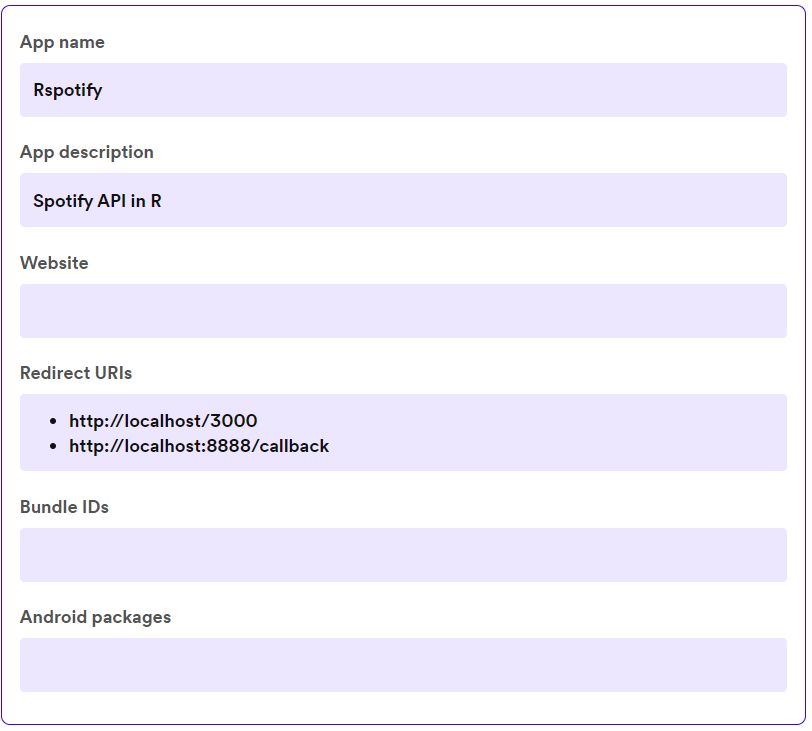 Example of fields entered in the spotify dashboard.
Then you, just need to open R, load the libraries we are going to use.
library(spotifyr)
library(dplyr)
library(tidyr)
library(readr)
library(purrr)
library(stringr)
library(ggplot2)
library(forcats)
and then copy the client id and client secret into R and get the access_token.
Sys.setenv(SPOTIFY_CLIENT_ID = "My-client-id")
Sys.setenv(SPOTIFY_CLIENT_SECRET = "My-client-secret")

access_token <- get_spotify_access_token()
Then you need to read the artist and album database or any other data frame. In this case, I am going to use a small example with some albums I like.
df <- tibble(artist = c("Warbringer", "Satyricon", "Meshuggah"),
            album = c("Woe to the Vanquished", "Rebel Extravanganza", "Obzen"))
Then we are going to use mutate to extract the genre associated with each artist. Since, not all artists have an associated genre (or can be found in spotify), it is advisable to use possibly to avoid errors if no genre was find in the Spotify database. Then use this function and finally, do some data wrangling to obtain each genre associated with an artist in a single row.
safer_process_file <- possibly(function(x) {
  resul <- search_spotify(x, type = "artist") |>
    slice(1) |>
    select(genres) |>
    unnest(cols = c(genres))
  ifelse(nrow(resul) == 0, NA, resul)
},
otherwise = list("Error in file"))

resul <- df |>
  # slice(1:9) |>
  mutate(genre = map(df$artist, safer_process_file))

resul_exp <- resul |>
  # slice(377) |>
  unnest(cols = c(genre)) |>
  unnest(cols = genre,
         keep_empty = T)
Finally, you might want to summarise this information into a plot of the most common genres in your df. So we are going to use a circular plot to show this.
# Make counts by genre and arrange by n
plotter <- resul_exp |>
  group_by(genre) |>
  count() |>
  arrange(desc(n)) |>
  ungroup() |>
  mutate(id = row_number())

# Based on: https://r-graph-gallery.com/296-add-labels-to-circular-barplot.html
# Get the name and the y position of each label
label_data <- data.frame(genre = plotter$genre,
                         id = plotter$id,
                         value = plotter$n)

# calculate the ANGLE of the labels
number_of_bar <- nrow(label_data)
angle <-  90 - 360 * (label_data$id-0.5) /number_of_bar     # I substract 0.5 because the letter must have the angle of the center of the bars. Not extreme right(1) or extreme left (0)

# calculate the alignment of labels: right or left
# Left part of the plot labels will have an angle < -90
label_data$hjust<-ifelse(angle < -90, 1, 0)

# flip angle BY to make them readable
label_data$angle<-ifelse(angle < -90, angle+180, angle)

# Start the plot
plotter |>
  ggplot(aes(x=as.factor(id), y=n)) +
  # This add the bars with a purple color
  geom_bar(stat="identity", fill=alpha("#8b1c61", 0.7)) +
  # First parameter: size of inner circle, second one, margins on the outer circle
  ylim(-50,100) +
  # Minimal theme
  theme_minimal() +
  # Transform normal bar plot to circular
  coord_polar(start = 0) +
  # Add the labels, using the label_data dataframe that we have created before
  geom_text(data=label_data,
            aes(x=id,
                y=value+0.5, label=genre, hjust=hjust),
            color="black",
            fontface="bold",
            alpha=1,
            size=2,
            angle= label_data$angle,
            inherit.aes = FALSE ) +
  theme(plot.margin = margin(-3, -10, -3, -10, "cm"),
        axis.text = element_blank(),
        axis.title = element_blank(),
        panel.grid = element_blank()#,
  )

ggsave("genreSimple.png",
       device = "pdf",
       width = 15,
       height = 15,
       units = "cm",
       dpi = 300)
The result:
 Circular bar plot of the genres.
It is pretty obvious I like metal! 🤘